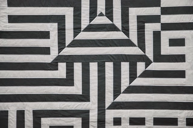
This quilt has been on my list for a very long time.
Ever since we visited an exhibition of art of the sixties (back in High School) I am fascinated by Optical Art.
To give you a general idea, here are some examples that I found online (doubleclick for source):
Movement in squares, Bridget Riley, 1961

Biadan, Victor Vasarely, 1959
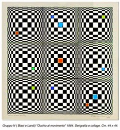
Occhio al Movimento, Alberto Biasi (Gruppo N), 1964
The artist that inspires me most is Victor Vasarely (1906 – 1997). The french-hungarian artist is considered as one of the founders of OpArt. He combined easy geometric shapes like squares, rectangles, triangles and circles to create stunning and eye dazzling optical illusions.
One of my favourites is this one.
Riu-Kiu-C, Victor Vasarely, 1960
I always thought that I would love to create a similar piece of art following his style. But somehow other projects (like lots of baby quilts for our friends) always took higher priority.
Then, last spring, our Modern Quilt Guild Bielefeld decided to take part in a quilt show and our general topic was “Solids Only”. So I had to create a quilt that is made entirely of solid fabrics. Ha! Enter Riu-Kiu-C.
I drew up a pattern using only rectangles and some triangles. Here you can see that pattern when the quilt was almost finished – with lots of handwritten additions:
As I wanted a slightly more soft contrast, I decided on a white and grey colour scheme instead of white and black. I am glad I did and I have to say, that the finished quilt is probably one of my favourites ever.
It just turned out the way that I hoped it would.
Piecing was not easy because it had to be very exact and precise. Especially those diagonal seams were a pain. The seam ripper came out more than once…! I have a love-hate relationship with him. Can you relate?!
I debated with myself for quite a long time because I could’t make up my mind about the quilting design. I usually prefer free motion designs over straight line quilting but this time a simple outline won. I took some white aurifil and outlined every seam – but only on the white strips. The grey fabric remains unquilted. I am glad I did not venture our for a more “artistic” design. It adds a clean and simple look to this modern design.
I initially envisioned it to be a modern wall hanging…
…but when I was looking for backing fabrics I found a perfect match in a dotted flannel.
Flannel is quite a heavy choice as backing for a wall hanging but it is oh so soft for snuggling. The quilt ended up rather big (1,65m x 2,25m) so I guess the whole family can snuggle up under it. Now to find a new (and smaller) wall hanging for our living room (o:
I finished the quilt with a single fold binding and zig zag stitch. Lately I prefered the single fold binding over double fold binding as it adds less bulk to the quilt. But I have no experience regarding durability. Do you know whether double fold binding will last considerably longer than single fold?!
This is my second entry for Blogger’s Quilt Festival Spring 2015. Please visit Amy and her online festival of fine quilts. There is much to be seen and to discover.
If you came over from Blogger’s Quilt Festival, please consider leaving a comment so I can see you were here and repay the visit!
Happy Quilting!
Christine
P.S. Oh, and I even finished the quilt in time for “Quilt Art Nürtingen”, the quilt show it was intended for. There’s nothing like a close finish. Even if you knew 12 months ahead what you were going to make, right?!


It's absolutely fantastic! What an amazing job making all your pieces line up so perfectly.
ReplyDeleteGorgeous! I love those op art pieces you linked, I need to make a quilt based on these too! I absolutely agree that grey rather than black was the best choice. Love the finished quilt!
ReplyDeleteLove it.
ReplyDeleteWOW! That makes my eyes go crazy... which makes me think you totally hit the nail on the head. I'm impressed by that piecing. Oh the seem ripper! :)
ReplyDeleteWhat a spectacular quilt! The design is so impressive as is your execution of it! WRT the single fold vs double fold binding, everywhere I read binding discussed, they say that double fold lasts longer. I think that it would require many, many, many years, however for single-fold binding to shred, so you are likely safe for many decades. At that point, it could just be redone if it frays.
ReplyDeleteOh my stars! This is unbelievably stunning! I'm mesmerized! Your craftsmanship is lovely and I agree with your choice to use grey instead of black - it's still graphic and bold but not so stark. I love everything about this!
ReplyDeleteWow, this is really wonderful!
ReplyDeleteOh, ich habe deinen Quilt live in Nürtingen gesehen und er ist soooo genial! Er war definitiv einer meiner Favoriten! Ich liebe auch sie grafischen und optischen Muster sehr gerne.
ReplyDeleteliebe Grüße aus Stuttgart, Rike
Christine, you'll excelled yourself! It's stunning!! I love the white/grey combo and such an effective design :)
ReplyDeleteThis is fabulous!! Beautifully executed and your quilting choice is perfection!
ReplyDeleteGreat quilt! That is some awesome piecing!
ReplyDeleteWhat an amazing quilt! Stunning!
ReplyDeleteWhat a fantastic design- and it's a beautiful quilt. I especially love the gray and white combo
ReplyDeleteWow totally stunning! I really love everything about this and so great to see the whole process with the original inspiration. Being an 'old school' quilter I always use a single fold binding. I have quilts that have been used for 20 years with this binding and it is still in perfect condition. I think the whole double fold binding thing is a fabric manufacturers/suppliers con!
ReplyDeleteThis is absolutely beautiful such a fanatastic job thank you for showing
ReplyDeleteYou can just redo the binding. I have a few 10 year old quilts with worn binding but it's so easy to fix. I love this!
ReplyDeleteDein Quilt ist einfach eine Wucht! Die Farbwahl mit Grau ist perfekt und gefällt mir super. Von Bridget Riley hatte ich auf der Art Cologne auch einige Sachen fotografiert und für nachahmenswert erachtet. Wenn man da einmal eintaucht bei diesen Künstlern, dann hat man plötzlich ganz viele tolle Anregungen... Deine Inszenierung des Quilts mit dem roten Sessel davor ist grandios. Wo hast Du denn das Wahnsinnsfoto gemacht?
ReplyDeleteOh, this is stunning, and my dear, those intersections were worth every effort! Love this quilt! A double-fold bias binding gives the most durability (grain on the bias over the edges), but I just do whatever looks good to me. :) Your binding looks beautiful and the quilt is just perfect! I wouldn't change a thing!
ReplyDeleteWow, this quilt is stunning. You've done a great job!
ReplyDeleteYour quilt is amazing, those diagonal seams may have been a pain but they look fantastic! Good luck with the festival :)
ReplyDeleteGreat design. The use of gray worked out really well. Love the connection to the fine art world.
ReplyDeleteWhat a great job you've done with your quilt, looks fantastic. I've heard that single binding is all that's needed, because when you think about it, even if a double binding starts to wear, you would have to replace it all anyway.
ReplyDeleteMaybe a pain, but wow those seams turned out soooo well! The stripes match up perfectly. I really love this.
ReplyDeleteThis is an amazing quilt - I love every aspect of it and your choices and dedication to precision throughout have paid off beautifully. It really does look good as a wall hanging - do you have a larger space to display it?
ReplyDeleteOh. My. Word. I am in love. I worked on a mini with the diagonals and straights like this, and yes. Matching the seams is hell. You did a spectacular job. This is really gorgeous and modern and striking. Love it. Great work.
ReplyDeleteThis is an amazing quilt! Your piecing is perfect to have gotten such precision, I love the design.
ReplyDeleteWell, you blew me away. It is simply stunning, awesome job. I LOVE it.
ReplyDeleteI would have never thought that grey and white or op art would attract me, but this perfectly pieced piece has! Great!
ReplyDeleteThis is terrific--I'm a Vasarely lover, too, and I agree that his designs are begging to be made up as quilts, so I'm glad you jumped in (you are much braver than I). The piecing is magnificent, perfect, and the overall quilt has such a punch!
ReplyDeleteWell done--
Elizabeth
www.opquilt.com
Really spectacular, a beautiful job!
ReplyDeleteIt's just stunning!
ReplyDeleteWell done - this is a wonderful quilted representation of Vasarely's work! Have you visited his museum in Aix-en-Provence? It was one of our children's favourite museum stops on our trip to France a few years ago.
ReplyDeleteVisiting from BQF - I voted for your op art quilt for viewer's choice. Love it!
ReplyDeleteVery cool, and a great use of two contrasting colors! I love the asymmetry of it all.
ReplyDeleteFabulous quilt, awesome execution from start to finish!
ReplyDeleteLove this quilt! It got my vote!
ReplyDeleteThis is stunning. The picture with the red armchair should be in a magazine! Just wow!
ReplyDeleteI commented using the wrong profile! Ms Keith is me, just marking some homework and hadn't realised that my teacher profile was selected.
ReplyDeleteCongratulations. A most worthwhile finish. I enjoyed the story behind the quilt
ReplyDeleteThis quilt is wonderful - I saw it on Pinterest and I just had to know more about it!
ReplyDeleteOh my gosh ! This is simply stunning ! Now you have got my brain spinning with ideas !
ReplyDelete